


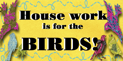
Ta DA!
Ok so what do you think now? i think i have it semi-fabulous! what do you think? still hard to read? Lance went to bed an hour ago and i got out of bed because i couldn't leave it the way it was , and i hadn't gotten to try more stuff with it. SOOOOOOOOOO? what do you think? i think it is so me! hard to read? i bold-ed the font and made it huge for read ability! does it help? i need opinions, feel free to tell me if it is hard on the eyes, or too many patterns, i may not change it , but if you have an opinion feel free to share so i can weigh it.
oh and for the tutorial see Jen's blog , she has one posted. so give it a try, i am semi computer tarded and still managed. i didn't check out all my options though and i didn't embellish anything yet. i think you have to play with it. and i don't use the original template suggested, i use minima lefty F.Y.I. and it still works.

![]()


8 comments:
Yes!!! I love it and think it looks great!
I like what you did. I like the textures. Glad you did the bigger letters and the bold, it made it easier for me to read. You asked for opinions so I am giving mine. There is one area I would try to fix -- the quote from Hinckley. It is in my opinion that it is to BIG. Just needs to be a little smaller. Other than that I am glad you had a good time redoing your page.
Semi computer tarded? I laughed out loud! I think it looks fabulous!
This is perfect! So Cute and so you!!!
Thanks for the info- yours look great- I may have to play around with changing mine.
Thanks for the tip!!! Definately going to try it out . When I have no helpers ruuning around ofcourse:):)
I love it! I downloaded that same black linen paper for future use! Looks great. Now you will have to tell me what measurement you have your header at.
I love the diamonds with the black and your topper!!! SO CUTE!! I need to be educated on this.
Post a Comment