TADA! i love my new blog look! HEEHEEHEE!


 #1
#1 #2
#2 #3
#3
well with overwhelming votes against dots. i went with a smoother solid black. and changed the bling to white just because.
i opted for the green topper. since it looked fab surrounded by the damask. and the damask one didn't look as fab. i also made a green color picture topper. but i like the black and white.
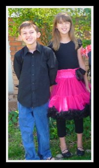
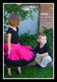
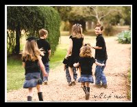
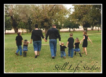
and the picture is from Easter this year. Pierce was having none of the line up in age order pictures. so he was chillin' out waiting for that to be over.
the credits.
all papers from page 2 are from this kit. Britt-ish designs. Just married kit. and her freebie the just married addon!.
love the colors , the damask. the pink and i love green too! this kit screams crazymama! i had to have it.
i did use summertime designs solid black and the black lace from vintage oreos kit. the solid black in page #3 and the black lace in all 3 pages.
and ended up using my fave go to paper from Tangie's metal sidebars freebie black solid paper. in page one. the keeper.
and there we are. WHOOHOO. stay tuned for a new topper. another new one this is too small.
and maybe some cute label bars. if i get the time. I'm dying to make some cuteness. whoohoo!
if i can figure it out.
special thanks to Janna, for her technical expertise, she made it simple,and i was doing it the hard way. she is a freaking genius!
also thanks to ONEHM, the digiscrap guru on my cell phone.
and my sister. who shares her opinion freely. when i call and ask of course.
WHOOHOO!















17 comments:
DOTS all the way!!
♡ Dots are very cute but a little hard to read with them... Loving the layout! :)
I think the dots make it a little busy.
I love dots, but agree they are a little busy.
NOT DOTS!!!
Hallie :)
Oooo....I like the dots, but the white words are hard with it....but I think I could handle it. I'm not blind yet! :)
I like this one best!
wow!! this looks sooo cute!
Yahoo!!! You figured it out!!!
You are welcome.
I love #2 but it might be hard to read on.
OK, I guess I should have been more careful when voting first...I LOVE this...anyway you do it, it looks FAN-FREAKIN-TASTIC!!
;)
You are awesome.
LoVe the new look! Love the new topper and that picture is adorable. Perfect with him laying there I think. Wow, you are a pro doing layouts!!
LOVE IT, LOVE IT, LOVE IT!!
you know i love that picture of your kids!! i love the green too. you have got some MAD skillz!!
love,love,love IT!!
I love your header! Cute cute picture! Did you know that we have our order of kids in the exact opposite?! So maybe if I got really brave and had #6 it would be a little girl?! We'll see how #5 goes first...
Cute stuff CM!!!
I am so distressed that I have officially fallen OFF the top commenters list. I think I will hide in my room for a while and eat icecream and be depressed. Boooooooooo!
I so totally LOVE that photo....That is the beauty of all the kiddos....AWESOME pictures that people with just a few kids will never get! I am so copying this one...someday!:)
LOVE the new look...i like solid black easier to read!
Post a Comment